
Today's post focuses on looking for anomaly based on exposed assets from Shodan for Polish government. The visualization that was prepared presents Internet facing infrastructure with additional features which will be explained in details. It helps in red teaming assessments allowing to spot weak points in infrastructure and prepare best recon as possible.
The visualization was prepared in d3js technology with help of Loris Mattioni. If you are looking for creative dataviz engineer, I strongly recommend Loris.

You can check redacted viz below
https://woj-ciech.github.io/Shomap/shomap_viz_example.html
Introduction
Cyber reconnaissance is a very broad topic, no matter whether you are tracking threat actors or doing offensive tasks like red teaming for government or big corporation. It includes working with large datasets, many sources and a lot of variables, but the end goal is often the same, to find something out of the norm.
In HUMINT investigations it might be different WHOIS email address that pops out for the same one person, in corporate investigations it might be a company incorporated in other place that usual. However, I focused on researching Internet facing infrastructure of the Polish government. This is kind of red teaming assessment, or at least, one of the techniques that for sure can help to spot gaps and find entry points.
I was wondering how threat actors/APTs do they reconnaissance in terms of easy wins, like for example exploiting Internet facing VPNs. Best sources are of course Shodan, BinaryEdge or Zoomeye and the first one was used in the research. With good query you can find assets located in specific network or ones that belong to specific government/organization.
In next part, I will explain how data are gathered and prepared for visualization as well as part of the visualization itself and how to transfer network graph into "cluster network" in d3js.
After that, real case scenario of Internet facing assets of Polish government will be presented. You will know how to interpret the results and find anomalies & gaps after this article.
Shomap script
The process consists of two steps, first one is to gather and parse data properly to the format that suits visualization and second step is to play with viz and spot any anomalies or check what is the best possible way to compromise the network.
First, let's focus on collecting & parsing data.
I used Shodan API to retrieve results based on the given query.
with open("shomap_data.json","w+") as f:
    for counter in count():
        try:
            results = api.search(query,page=counter+1)
        except Exception as e:
            print('[!] Problem with Shodan API ' + str(e))
            sys.exit()

        print("[*] Retrieving page " + str(counter + 1))

        if counter == args.pages: #break on given page
            break
Above code creates a new json file, iterates over the pages and break on given page number. You can find how many pages exist for your query directly in Shodan UI, you have to divide total results by 100 results per page.
Later, we prepare the results to the proper format and save it as a json file.
more_super_dict = {"nodes": [], 'links':[]}

for c,i in enumerate(results['matches']):
    super_dict = {'id': asset_id, 'org': '', 'asn': i['asn'], 'port': i['port'],
                  'hostnames': i['hostnames'], 'city': i['location']['city'],
                  'lat': i['location']['latitude'], 'lon': i['location']['longitude'],
                  'country': i['location']['country_name'], 'domains': i['domains'], 'title': '',
                  'common_name': '', 'ip': '', 'organization': '', 'vulns': [], 'isp': i['org']}

    asset_id = asset_id + 1

more_super_dict['nodes'].append(super_dict)
rsult = json.dumps(more_super_dict, indent=4)
print("[i] File has been saved as shomap_data.json")
f.write(rsult)
The format that suits visualization looks as follow:
{
    "nodes": [
        {
            "id": 0,
            "org": "",
            "asn": "AS[REDACTED]",
            "port": 443,
            "hostnames": [
                "www.gov.pl"
            ],
            "city": "Warsaw",
            "lat": 52.22977,
            "lon": 21.01178,
            "country": "Poland",
            "domains": [
                "www.gov.pl"
            ],
            "title": "Portal Gov.pl",
            "common_name": "gov.pl",
            "ip": "194.181.92.105",
            "organization": "Ministerstwo Cyfryzacji",
            "vulns": [],
            "isp": "NAUKOWA I AKADEMICKA SIEC KOMPUTEROWA INSTYTUT BADAWCZY"
        },
        {
            "id": 1,
            "org": "",
            "asn": "AS[REDACTED]",
            "port": 80,
            "hostnames": [
                "[REDACTED].gov.pl"
            ],
            "city": "Wroc\u0142aw",
            "lat": 51.1,
            "lon": 17.03333,
            "country": "Poland",
            "domains": [
                "[REDACTED].gov.pl"
            ],
            "title": "[REDACTED]",
            "common_name": "",
            "ip": "[REDACTED]",
            "organization": "",
            "vulns": [],
            "isp": "[REDACTED]"
        },
        [..]
],
    "links": []
}
Nodes keep information about hosts, which are presented above.
Links are empty yet but in the next phase we have to make connections which are necessary to group the nodes and show it clearly on the visualization. In the end, links will be hidden anyway to make graph more readable.
I set up couple categories which we can group based on
- Port
- ISP
- Country
- City
- Certificate
So, to create the groups or clusters of nodes, we need to add new node which will be describing the group and connects rest of the nodes to the newly created one for this group. It may sounds complicated at the beginning but I will show it's not that hard.
It means if we have 100 nodes with port 443, we have to create new node (for port 443) and link all the 100 to it.
It can be achieved with following code
nodes_set = set()
help = {}
categories = ['port', 'isp','country','city']
for category in categories:
    print('[*] Grouping by ' + category)
    with open(path, "r+") as f:
        json_f = json.load(f)

        for i in json_f['nodes']:
            if i['port'] == 0: # if it finds "fake node"
                break
            if i[category] not in help.keys():
                nodes_set.add(i[category])
                last_id = json_f['nodes'][-1]['id']
                help.update({i[category]: last_id + 1})
                json_f['nodes'].append(
                    {"id": last_id + 1, "org": i[category], "country": i[category], "port": 0, "city": "", "isp": ""})
                json_f['links'].append({"source": i['id'], "target": help[i[category]], "value": 1})

            else:
                json_f['links'].append({"source": i['id'], "target": help[i[category]], "value": 1})

        f = open("shomap_data_"+category+".json", "w")
        f.write(json.dumps(json_f, indent=4))
        f.close()
First, it iterates over the categories and then over the nodes from previously gathered results stored in our json file.
Basically, we have two cases, when the node is found for the first time, so we need to add it to the existing one as a "fake" node, which will keep group together.
Second case is when the fake node has been added and we need to add new link between them.
And the final json format of the links is presented below
"links": [
        {
            "source": 0,
            "target": 991,
            "value": 1
        },
        {
            "source": 1,
            "target": 992,
            "value": 1
        },
        {
            "source": 2,
            "target": 993,
            "value": 1
        },
        {
            "source": 3,
            "target": 994,
            "value": 1
        }
Script creates 5 json files during process, one for each category with proper links to the groups and they are loaded when user clicks button.
To quickly sum this up, this is example command to retrieve 10 pages for query "hostname:gov.pl"
┌──(venv)(root💀kali)-[~/PycharmProjects/shomap]
└─$ python shomap.py -p 10 -q "hostname:gov.pl"

    ,-:` \;',`'-,
  .'-;_,;  ':-;_,'.
 /;   '/    ,  _`.-\
| '`. (`     /` ` \`|
|:.  `\`-.   \_   / |
|     (   `,  .`\ ;'|
 \     | .'     `-'/
  `.   ;/        .'
jgs `'-._____.

[*] Gathering data from Shodan
[*] Retrieving page 1
[*] Retrieving page 2
[*] Retrieving page 3
[*] Retrieving page 4
[*] Retrieving page 5
[*] Retrieving page 6
[*] Retrieving page 7
[*] Retrieving page 8
[*] Retrieving page 9
[*] Retrieving page 10
[*] Retrieving page 11
[i] File has been saved as shomap_data.json
[*] Preparing visualization
[*] Grouping by port
[*] Grouping by isp
[*] Grouping by country
[*] Grouping by city
and the content of directory should be as follow
┌──(venv)(root💀kali)-[~/PycharmProjects/shomap]
└─# ls -al
total 4124
-rw-r--r-- 1 root root   1155 May  7 15:15 README.md
-rw-r--r-- 1 root root 844428 May  8 17:35 shomap_data_city.json
-rw-r--r-- 1 root root 835539 May  8 17:35 shomap_data_country.json
-rw-r--r-- 1 root root 871492 May  8 17:35 shomap_data_isp.json
-rw-r--r-- 1 root root 737469 May  8 17:35 shomap_data.json
-rw-r--r-- 1 root root 843882 May  8 17:35 shomap_data_port.json
-rw-r--r-- 1 root root   4367 May  7 15:38 shomap.py
-rw-r--r-- 1 root root  15185 May  7 15:15 shomap_viz.html
New json files for each category are called "shomap_data_city.json", "shomap_data_country.json", "shomap_data_isp.json" and "shomap_data_port.json".
And now we have everything prepared and can move on to the next part - visualization.
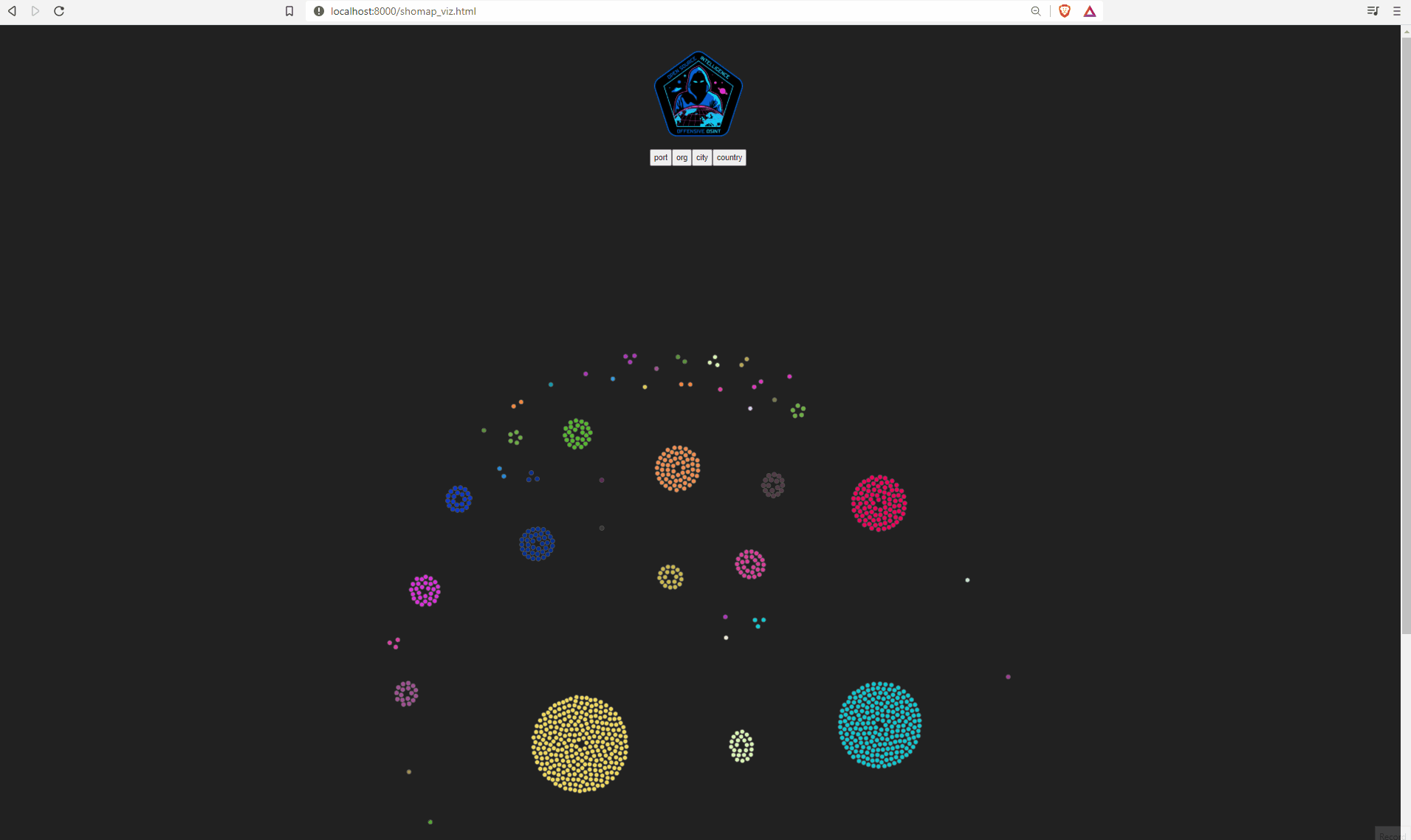
Shomap Viz
In this part, I will describe how visualization has been created and what caused the most troubles. Again, I've got a lot of help from @lorismat_, take a look on his amazing work.
I did some graphs for couple previous research but this one is definitely more complex and interactive as well as works with bigger datasets.
From usual user perspective, there are no magic here, you click the button and nodes start to group themselves depends of the button you pressed. Behind the curtain tho, couple tricks have been applied to make it work and look nice.
As you could see, beside visualization there are couple buttons that are responsible for grouping nodes. They were added in following way
var buttons = d3.select("#option").selectAll("button")
    .data(["port", "isp", "city", "country"])
    .enter()
    .append("button")
    .attr("id", function(d) {
        return d;
    })
    .text(function(d) {
        return d;
    })
and also used as a jquery selector as below
$("#port").on("click", function() {
    restart("port", "shomap_data_port.json");
});
$("#isp").on("click", function() {
    restart("isp", "shomap_data_isp.json");
});
$("#city").on("click", function() {
    restart("city", "shomap_data_city.json");
});
$("#country").on("click", function() {
    restart("country", "shomap_data_country.json");
});
It loads different files, that have been created for each group, when button is clicked.
And we execute d3js simulation for each category.
else if (btn == 'country') {

    simulation
        .force('center', d3.forceCenter(width / 2, height / 2))
        .force('collision', d3.forceCollide().radius(20))
        .force('link', d3.forceLink().links(graph.links))
        .force("charge", d3.forceManyBody().strength(-10))
        .force("x", d3.forceX())
        .force("y", d3.forceY());

    circle.style("fill", d => colorCountries[d.country])

    simulation.on('tick', ticked);
}
Basically, we create a new simulation and set up a parameters like center, collision, links and charge as well as define x and y axis. These parameters can be flexible depend of the end effect you want to achieve.
Other tricks include getting unique groups and assign new color to them with each click.
// --- creating palette as object for Ports, ISP and Cities to set up dynamic colors
        // 1) arrays of distinct values
let distinctPorts = [];
let distinctISP = [];
let distinctCities = [];
let distinctCountries = [];


for (let i = 0; i < graph.nodes.length; i++) {
    distinctPorts.push(graph.nodes[i].port);
    distinctISP.push(graph.nodes[i].isp);
    distinctCities.push(graph.nodes[i].city);
    distinctCountries.push(graph.nodes[i].country);
};

distinctPorts = Array.from(new Set(distinctPorts));
distinctISP = Array.from(new Set(distinctISP));
distinctCities = Array.from(new Set(distinctCities));
distinctCountries = Array.from(new Set(distinctCountries));


// 2) palette creation
let colorsPorts = {};
let colorsISP = {};
let colorsCities = {};
let colorCountries = {};


function paletteCreation(arr, obj) {
    for (const key of arr) {
        obj[key] = `rgb(${parseInt(Math.random()*255)}, ${parseInt(Math.random()*255)}, ${parseInt(Math.random()*255)})`;
    }
    return obj
}

colorCountries = paletteCreation(distinctCountries, colorCountries)
colorsPorts = paletteCreation(distinctPorts, colorsPorts);
colorsISP = paletteCreation(distinctISP, colorsISP);
colorsCities = paletteCreation(distinctCities, colorsCities);
and this way we have assigned random colors to each group of nodes and we execute it as below
$("#city").on("click", function() {
    circle.attr("fill", function(d) {
 return colorsCities[d.city];
})
});
From other things from the visualization, it's worth to take look on hiding links by setting opacity to 0
link
    .attr('class', 'link')
    .attr("opacity", 0)
To hide fake nodes, additional key is being created during parsing phase of the script. It sets 0 or 1 to the node according it's destiny and then we again change opacity as follow
.attr("opacity", d => d.fake === "" ? 1 : 0)
Full visualization is available on my github and presents anonymized exposed assets of Polish government, which I will analyze in next chapter.
Analysis "hostname:gov"
It is a perfect example what you can get when you mix OSINT & Cyber intelligence & DataViz & Python. I know it's not a standard procedure for red team to present the results in this way, but it looks cool and helps quickly spot anomalies.
You can choose whatever query you like, I've decided to use "hostname:gov.pl". Shodan fans perfectly know what it means, for the rest, it displays hosts with the given hostname, in this case it's gov.pl responsible for keeping assets of Polish government. Hostname can be spoofed but during analysis, it's easy to exclude such servers.
There are 2700 results for this query. For such amount, the visualization might be sluggish, so keep this in mind. Here, I'm presenting screens with all of the nodes, and viz with ~1000 nodes for same query is available on my github.
By default, visualization is grouped by port
When you hover cursor over nodes, tooltip will reveal details such as port, ISP, city and country. This way we can quickly find what group it represents.
The most popular ports for this hostname are
- 80
- 443
- 25
- 53
- 8008
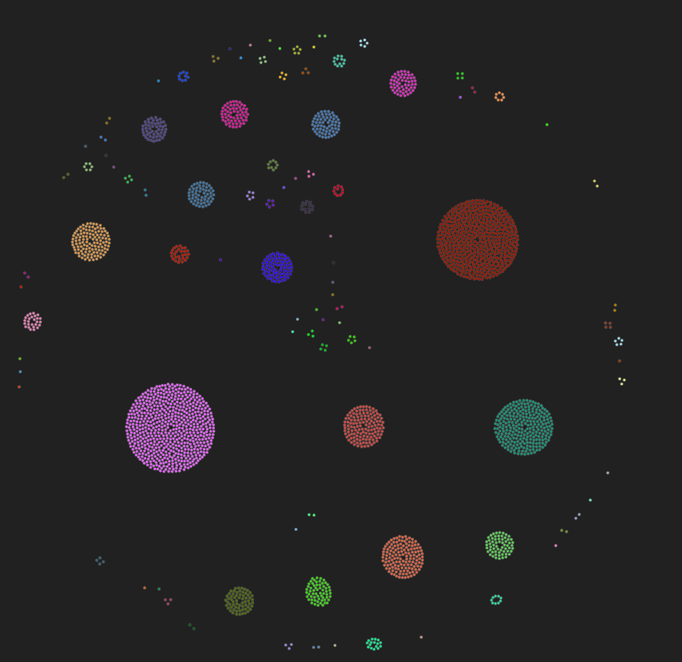
We can also group it by country, which shows what assets are being hosted on a foreign land.
The countries are as follow
- Poland
- France
- Czech Republic
- Finland
- Belgium
- Austria
- Netherlands
- United States
- Denmark
- Colombia
Of course, we can dig deeper into each group and assets respectively. Let's take a look on the next network, it's sorted based on the organization.
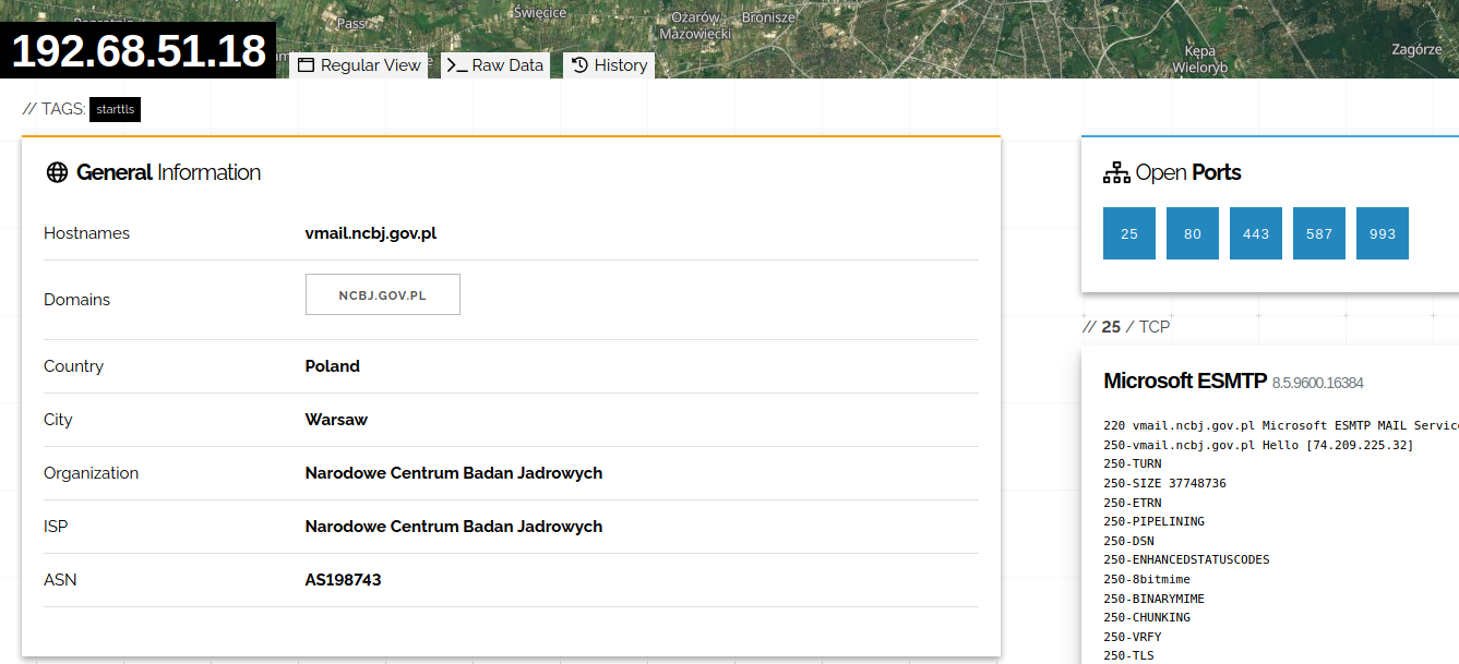
What brought my interest are organizations like
- Narodowe Centrum Badan Jadrowych (National Center for Nuclear Research)
- Kancelaria Sejmu
- Komisja Nadzoru Finansowego (The Polish Financial Supervision Authority, hacked by North Koreans in the past :))
- Centrum Informatyki Resortu Finansow (IT Center of the Finance Ministry)
- Ministry of Digital Affairs of Poland
- Instytut Lacznosci - Panstwowy Instytut Badawczy (National Research Institute)
- and many other departments and offices
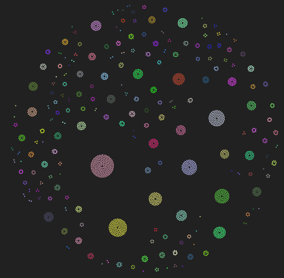
If you think you have discovered something meaningful, you can click on the node and additional information will be displayed, including link to the asset in Shodan.
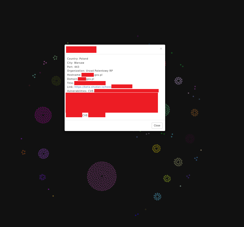
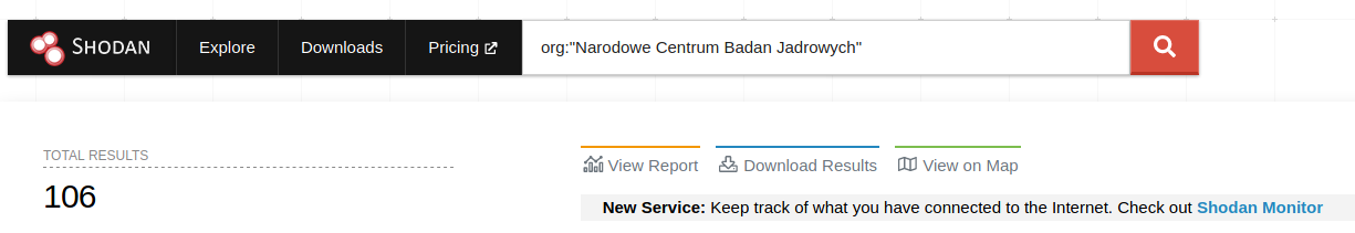
Beside analyzing this particular host and trying to connect, we can click on the ISP or Organization and Shodan will display results for this query. This way, we have full visibility what is kept in this netblock and explore it looking for leaks/gaps/vulns.
and clicking on the organization name will lead you to results only for this organization. In this way you can quickly move from one asset to whole network looking for different exposed hosts and ports.
Conclusion
In my personal opinion this visualization is beautiful and I had a lot of fun researching different governments and corporations. As I said before, it's not a standard procedure to do such graphs during standard red teaming exercise and I haven't seen anything like that but it definitely helps to find anomalies and hosts that could provide easy entry point to the whole network.
Again, big shout out to @lorismat_ for helping me preparing this visualization.